Good Juju took a colorful approach in the green-brand development and launch of this island-wide recycling initiative, Opala.org (Opala means “trash” in Hawaiian). Good Juju worked closely with the refuse division to develop the Opala.org brand and create a comprehensive set of functional communication pieces with mass appeal. The project included creation of a logo, tagline, brand manual, signage, advertising and direct mail.
PROBLEM/BACKGROUND:
Massive changes were underway for residential refuse collection island-wide. Over 160,000 single-family homes were being required to sort their trash using a new three-cart system. Complicated systems required a staged roll-out and over 20 regionally customized messages to be delivered at specific times. The challenge was to prevent public frustration and generate community enthusiasm, cooperation and proper implementation for the new system.
The changes themselves were complicated. The twice-a-week combined refuse system was being changed to a once-a-week refuse pick up and a once-a-week recyclable materials pick up which required the sorting of general waste, green waste and paper/glass materials. While general waste would be picked up weekly, the recyclables would happen on alternating weeks.
Residents needed to learn new pick up schedules as well as a host of new rules and guidelines for sorting trash, and when and how they placed their carts at the curb appropriately for the new pick ups. The new system also included new truck routes; some residents who once shared a schedule with neighbors found they had different schedules and launch dates. Meanwhile, 20,000 homes would remain on refuse-only collection routes and were being asked to use community recycling bins.
SOLUTION:
Create and utilize a visual logic system consisting of: color-coding, universally understandable icons and user-friendly formats.
Phase 1: Corporate Identity Development – Logo Design, Tagline and Brand Manual.
[column col=”1/3″]
[/column]
[column col=”2/3″]
The Opala.org logo is designed for visual appeal and is a graphic depiction of recycling in action. Ribbons of color run from “Opala” (Hawaiian for “trash”) to their respective bins, demonstrating the process of sorting trash. The ribbons form a rainbow, a symbol of natural beauty and common in Hawaii. The tagline “Don’t dump on Hawaii. Sort it out.” doubles as a call to action, reminding residents that unsorted recyclables waste valuable landfill space.
[/column]
The Brand Manual ensured proper brand development by Opala.org’s many partners.
The Opala.org Brand Manual outlines brand building measures including logo and tagline usage and restrictions, corporate fonts, corporate colors, advertising templates. The Brand Manual enables the use of multiple design resources and ensures consistent look and feel across all communications while also protecting the young brand from denigration.
Phase 2: General Advertising & Recycling Container Signage.
Previously developed ads were revamped to include the logo and tagline and provided critical information on new refuse and recycling events.
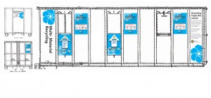
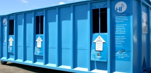
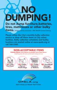
Bright and lively signage dressed up industrial containers that serve as Community Recycling bins while providing essential sorting information. End panels promoted the benefits of recycling including benefits to local schools for redemption of recycled goods.
[column col= “1/2”]
[/column]
[column col= “1/2”]
[/column]
[column col= “1/3”]
[/column]
[column col=”1/3″]
[/column]
[column col=”1/3″]
[/column]
Phase 3: Direct Mail Campaign.
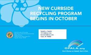
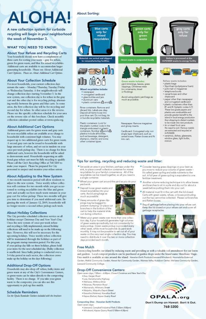
A sequence of mailers ensured residents received the information and were up to date on the status of their route. Version-able template designs provided a systematic and easy method for customized messages the result: quick and easy production with minimal confusion.
A deceptively simple looking mailer template was created to accommodate over dozen route-specific versions. Each mailer included detailed information about the new refuse pick up, sorting requirements, the benefits of sorting, and a calendar of pick up schedules specific to each home address. Design techniques included use of panels and organizing content to present a wealth of information in easy to follow segments.
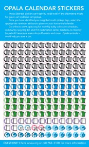
One mailer included stickers that residents to apply to their wall calendars while another included custom stickers to apply to their bins to help residents remember sorting rules and pick up schedules.
[column col = “1/2”]
[/column]
[column col = “1/2”]
[/column]
[column col = “2/3”]
[/column]
[column col = “1/3”]
[/column]